WHAT (YOU) FEEL
Verish의 컨셉은 눈을 가리는 것에서 시작합니다. 눈을 가리자 비로소 느껴지는 손끝의 감각에 집중하여, 불필요한 요소는 가리고 오로지 근본적인 요소만 남깁니다.

OVERVIEW
Verish 는 미니멀하고 직관적인 디자인을 통해 브랜드의 세련된 감각과 편안함을 강조합니다. 뉴트럴 톤 컬러를 활용해 우아한 이미지를 구축하고, 고해상도 제품 이미지와 감성적인 아트 디렉션으로 프리미엄 감각을 전달합니다. 세련된 산세리프 폰트와 모듈형 그리드 레이아웃을 적용해 가독성과 안정적인 시각적 흐름을 완성했으며, 불필요한 텍스트를 최소화하고 이미지 중심의 배치를 통해 감각적인 사용자 경험을 제공합니다.
Verish emphasizes the brand’s refined aesthetic and comfort through a minimalist and intuitive design. The use of neutral tones creates an elegant visual identity, while high-resolution product imagery and artful direction enhance its premium appeal. A sleek sans-serif typeface and modular grid layout ensure readability and a balanced visual flow. By minimizing unnecessary text and prioritizing an image-driven layout, the website delivers a seamless and engaging user experience.
사이트 바로가기


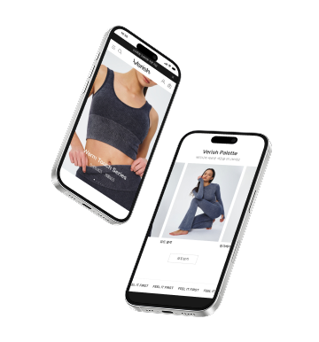
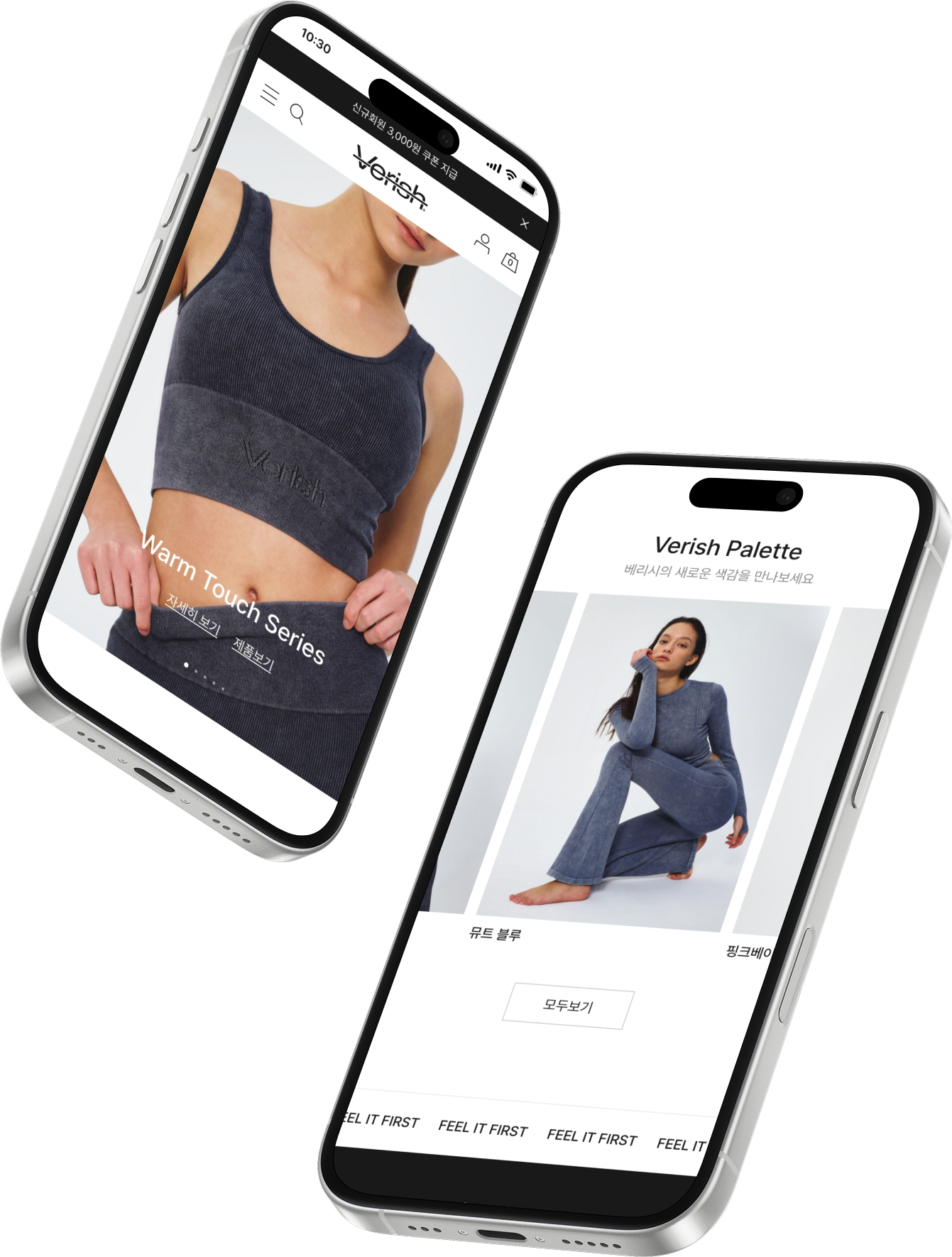
MAIN PAGE


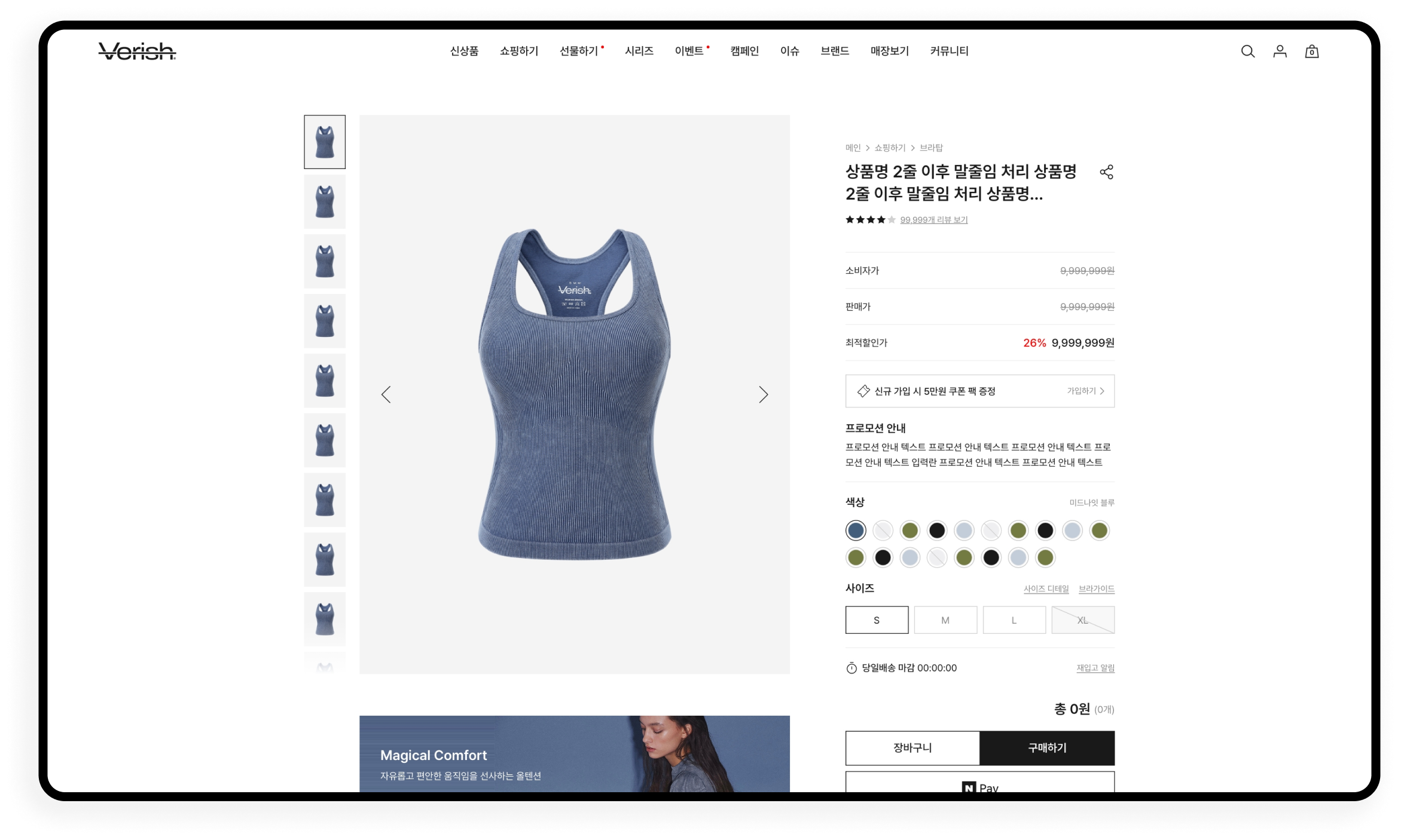

DESIGN ELEMENTS


